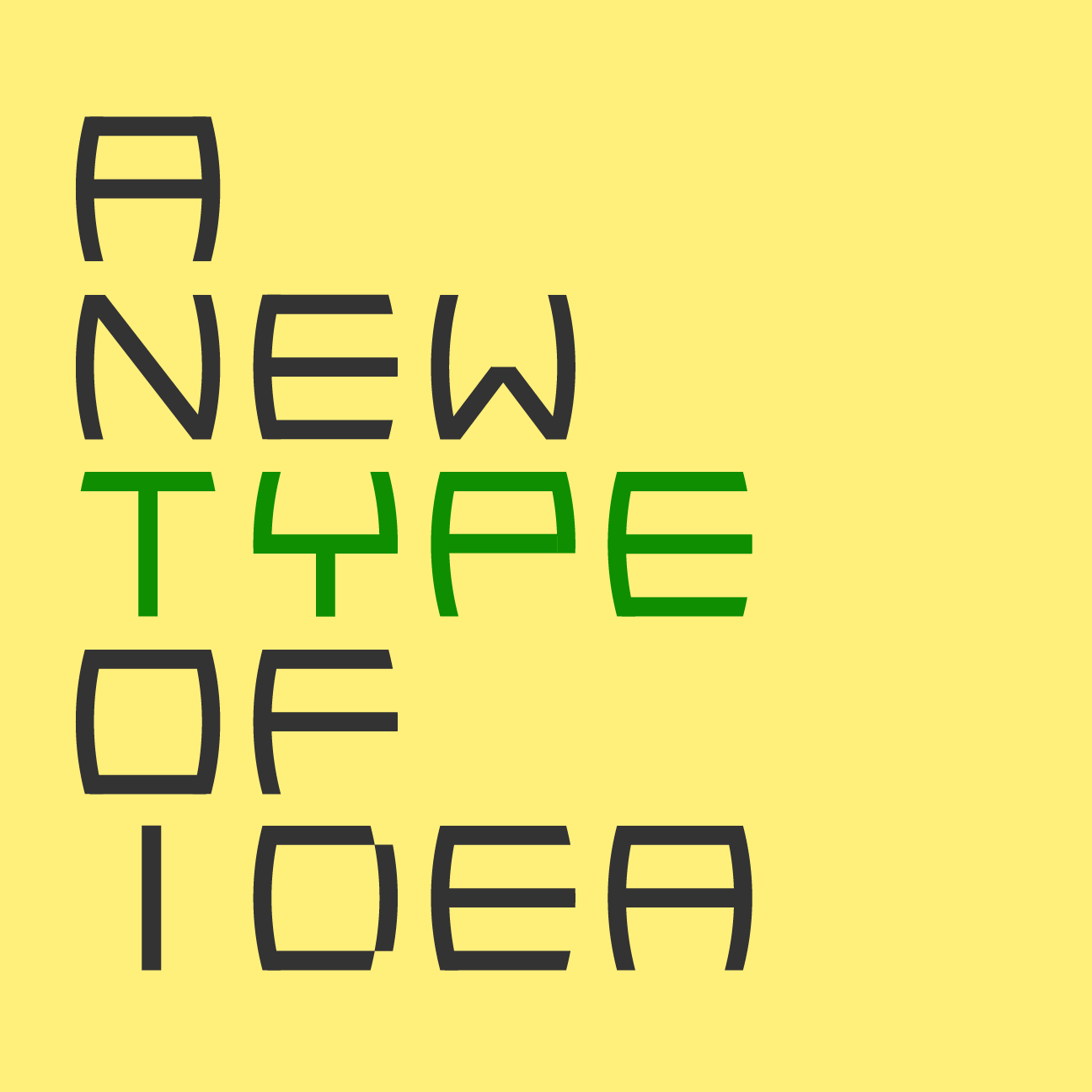
I recently designed a new identity for my music outlet called Tecosha. The name is an abbreviation of Textures, Colours, and Shapes.
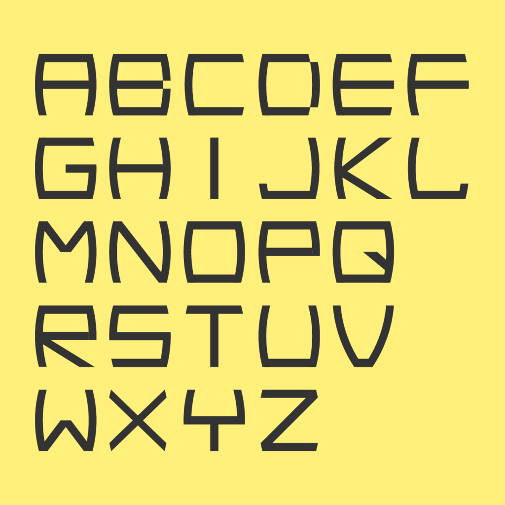
I created a minimalistic typeface to suggest the futuristic and mystic style of the latest music written. The letters all fit within a perfect square. The shapes give it a touch of seriousness and a dramatic edge. The style is influenced by old school sci-fi movie industrial lettering seen on spaceships. The lines and intersections are inspired by the structural shapes found in Korean letters.


